Colour loden (also called loden green, forest loden, or loden grey) sits between green and grey with muted, earthy tones. It feels calm, natural, rich and surprisingly versatile. In this article I’ll walk you through exactly what colour loden is, how it works in design and fashion, what palettes it pairs with well, plus concrete tips so you use it beautifully.
Origins and Meaning of Colour Loden
Etymology Where “loden” Comes From
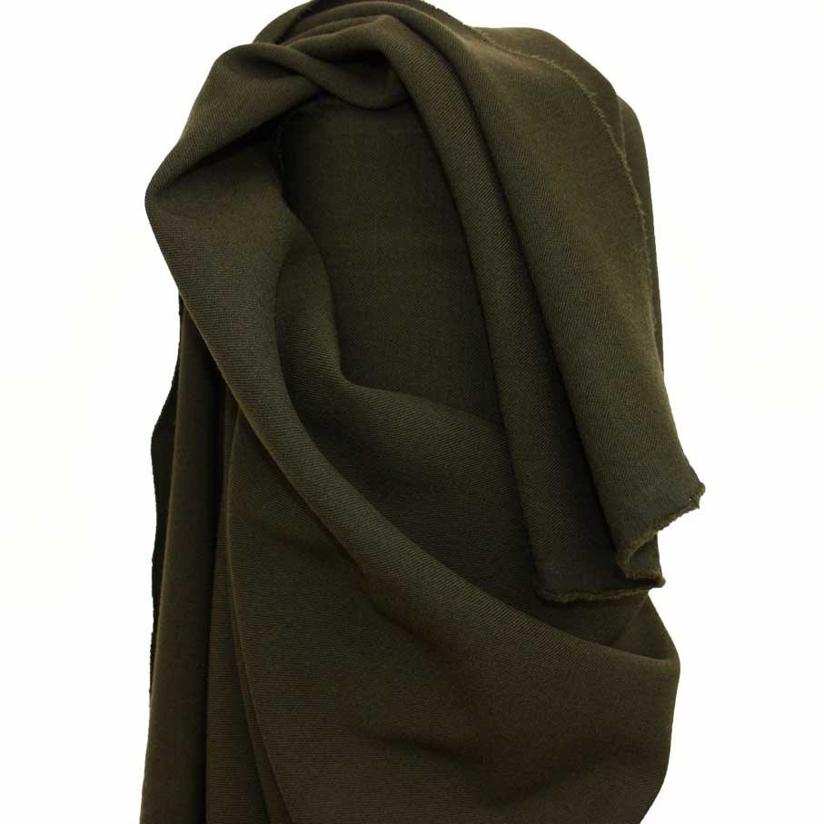
The word loden comes from the Germanic term for a thick, water repellent woolen cloth. In regions like Austria and Bavaria, loden cloth was used to make heavy coats that resisted rain and cold. Over time the term shifted from the fabric itself to the colour associated with that fabric: a subdued green grey.
Loden fabric originally had natural dyed fibres (often sheep’s wool) so the colour wasn’t bright or radiant. It absorbed tones of green, grey, sometimes a hint of olive, all blended through the natural fibres.
Cultural and Symbolic Associations
- Nature and wilderness: Because colour loden looks like moss, forest floor, muted foliage, people connect it with nature, forests, stability.
- Tradition and heritage: In Alpine regions, traditional clothes use loden cloth for jackets (Lodenmantel) and coats. The colour carries cultural weight: durability, rustic comfort.
- Utility and subdued elegance: Fashion, military uniforms, traditional outerwear often use variations of loden (like army green, olive green) because it hides dirt well and doesn’t call attention, yet remains stylish.
Appearance & Variations
Base Tone and Undertones
Colour loden usually has:
- a green base but not fresh or bright green
- strong grey muting, making it subdued
- undertones that vary: olive, khaki, moss, sometimes a bit of brown or even a blueish cast in certain lighting
These undertones mean different “loden” shades can look warmer or cooler.
Common Shades & Synonyms
Here are names and examples you’ll often see:
| Name / Synonym | Description | HEX / Approx RGB |
| Standard Loden Green | Balanced green grey with moderate saturation | #4A5D23 (RGB 74,93,35) |
| Forest Loden | Deeper, darker; more green, less grey | #3B4F2B |
| Light Loden | More grey, less saturation; almost soft sage | #6B7A4F |
| Loden Grey | Greyer still; the green is very muted | #575F4B |
| Olive Loden / Army Loden | Warm olive undertone; more yellowish green | #556B2F |
These aren’t strict definitions they overlap. The key is that colour loden stays muted, earthy, natural.
How Colour Loden Looks in Different Materials & Lighting
The same shade of loden might look very different depending on:
- Material: Wool or felt diffuses light; satin or paint reflects more. Loden cloth tends to look soft and rich; paint can look flat or cold if finish is matte.
- Lighting:
- Natural daylight often brings out green undertones clearly.
- Warm light (incandescent, yellowish bulbs) leans the shade warm, boosting olive or brown hints.
- Cool light (LED, overcast day) may bring grey or blueish cast, making it look more subdued.
- Surroundings: If near bright colours (white, gold) loden looks richer by contrast; if surrounded by grey or black it might fade or feel too dark.
Colour Theory & Pairing with Loden
Complementary and Contrasting Colours
To make colour loden shine, pairing matters:
- Complementary colours
Because loden is muted green grey, warm reds (brick red, rust, burgundy) work well. They form contrast without drama. - Contrasts with neutrals
Use creams, warm beiges, soft off whites to highlight loden without overwhelming your design. - Accent choices
Copper, mustard yellow, rose-gold, brass all these metallic or warm tones lift loden beautifully.
Harmonious Palettes Involving Loden
Here are some sample palettes:
| Palette Name | Colours Included | Mood / Use Case |
| Earth & Wood | Loden Green, Tan, Burnt Sienna, Rustic Brown | Cozy interiors, lodge-style cabins, rustic fashion |
| Cool & Calm | Loden Grey, Slate Blue, Soft Teal, White Smoke | Relaxed spaces, bathrooms, serene branding |
| Warm Accent Pop | Loden Green, Mustard, Terracotta, Cream | Feature walls, cushions, accessories |
Tips for Balance & Proportion
- Let loden serve as a base or background colour walls, large furniture, heavy fabric.
- Use brighter or warmer colours only as accents to avoid dulling the whole look.
- If applying loden in small rooms or low-light areas, use it sparingly: maybe just an accent wall, trim, or decorative elements.
Using Colour Loden in Fashion & Textiles
Clothing Items & Fabric Types
Colour loden appears in many materials:
- Outerwear: coats, parkas, wool jackets, waxed cotton all benefit from loden’s weathered, hardy feel.
- Knitwear & trousers: sweaters, cardigans, cargo pants that merge comfort with utility.
- Accessories: scarves, hats, gloves; leather belts or boots dyed in loden shades.
Fabrics like wool, tweed, linen, felt, even cotton canvas all take on the mood of loden differently wool richest, linen more airy.
Styling with Loden
How to wear colour loden so you look sharp:
- Pair loden coat with cream sweater and tan leather boots warm neutrals let loden stand out.
- For smart casual: loden trousers with white shirt and navy blazer.
- Outdoors or rugged: boots, waxed canvas gear + moss-green shirt + loden jacket.
It works best in autumn winter seasons because its earthiness matches natural landscapes; but lighter loden shades can pop in spring.
Textiles for Interiors: Upholstery, Curtains & Rugs
When bringing loden into the home via fabric:
- Upholstery: velvets or heavy linen in loden feel luxurious.
- Curtains: thick drapes soften the light and make rooms cozy.
- Rugs: jute or wool rugs with loden shades anchor space; tonal contrast works nicely with patterned rugs (e.g. checks, plaids) where loden becomes a ground tone.
Colour Loden in Interior Design & Decor
Walls, Ceilings & Architectural Features
- Accent walls in loden give depth ideal for behind bookshelves or fireplaces.
- Full rooms: dining rooms, libraries, dens can embrace loden for mood; pair with lighter ceilings.
- Trim, doors, built ins: doing them in loden adds richness without overwhelming a room.
Furniture, Upholstery & Soft Furnishings
- Sofas, armchairs in loden can become statement pieces.
- Mix textures velvet, wool, matte leather to play with light.
- Throw pillows, blankets, rugs serve to echo loden and tie things together.
Lighting & Ambience
Proper lighting decides whether colour loden feels cozy or gloomy.
- Choose warm LED bulbs (2700 3000K) for a welcoming feel.
- Mirrors or reflective surfaces help bounce light, soften shadows.
- Use layered lighting ambient (overhead), task (lamps), accent (spots) so loden picks up different faces.
Branding, Graphic Design & Web Use of Colour Loden
Loden in Logos, Websites & Print
Brands that want to suggest heritage, outdoor, eco friendly values often choose loden green or variations.
- Logos using loden green + cream or warm brown look stable and trustworthy.
- For business cards or packaging, loden grey or moss green can provide background depth.
Digital Challenges & Considerations
- Contrast & readability: text over loden background must have enough contrast; white or warm off white tend to work.
- Accessibility: WCAG (Web Content Accessibility Guidelines) require adequate contrast ratios test your combinations.
- Color rendering: screens vary; a loden shade might appear greener on some displays, more grey on others.
Sample Palettes & Inspiration
Here are two palettes useful in branding/web design:
Palette A: “Eco Heritage”
– Loden Green (#4A5D23)
– Cream (#F5F0E1)
– Terra Cotta (#C45A31)
– Soft Olive (#7B8D42)
Palette B: “Modern Calm”
– Loden Grey (#575F4B)
– Slate Blue (#6A7F8F)
– Warm White (#FCFAF8)
– Rose Gold Accent (#B76E79)
These palettes show how loden (or loden grey) anchors the design, letting accents pop.
Trends, Examples & Case Studies
Fashion Houses & Brands Using Loden
- Traditional alpine/wool brands in Austria/Germany still produce Loden coats in loden green it’s their signature.
- Outdoor and heritage brands (think waxed jackets, field gear) use styles in army loden or moss loden because they combine function with style.
- High fashion sometimes incorporates loden in fall collections—a muted green coat or dress works well during cold-weather runway shows.
Interior Design Projects
- A mountain lodge in the Alps renovated its interior. They painted beams and built-ins in standard loden; paired with deep wood paneling and brass fixtures. The result: warm, cozy, timeless.
- Urban apartments are using loden grey on kitchen cabinets; coupled with marble countertops and gold hardware to create contrast between luxury and ruggedness.
Before and After Transformations
| Project | Before | After (with Colour Loden) | Outcome |
| Living Room | White walls, light furniture, feeling cold | Painted one accent wall loden + loden-grey trim + cream sofa | Room felt cozier and more grounded |
| Wardrobe | Bright colours only, little cohesion | Introduced several loden items (coat, sweater), neutral base | Wardrobe feels more versatile, pieces match better |
| Café Interior | Pastel walls, mismatched furnishings | Doors & counters in loden green, combined with wood and leather accents | Café looks rustic & modern, customers praise atmosphere |
Pros, Cons & Practical Tips
Advantages of Choosing Colour Loden
- Timeless: muted greens rarely go out of fashion.
- Versatile: goes well with neutrals, warm tones, textures.
- Hides wear well: in textiles, loden conceals dirt, shadow, small stains.
- Nature connected: brings an outdoor calm into interiors or wardrobes.
Common Pitfalls
- If loden is too dark and whole room or outfit lacks light sources, things can feel dull or even gloomy.
- Overuse of loden without accent colours may look monotonous.
- Misjudging undertones: using a “warm loden” version when you need a cool tone (or vice versa) can clash with surroundings or skin tones.
Maintenance & Care
- For fabrics: wash/dry carefully; wool-based loden may need gentle cleaning to avoid felting or altering shade.
- For painted surfaces: matte or eggshell finish helps hide imperfections; use good quality paint so colour stays consistent under different light.
- Protect from sun: UV exposure may fade loden into a duller grey; curtains/blinds help in sunny rooms.
Conclusion
Colour loden offers something special: that earthy calm, a heritage edge, and flexibility. Whether you drift toward loden green, forest loden, loden grey, or olive-tinged versions, you’ll find uses in fashion, home decor, branding that look genuine and beautifully grounded.
Why not try it out? Grab a small sample patch of paint, a cushion, or a piece of clothing in loden. Mix it with neutrals or a warm accent and see how it changes your space or style. If you do, share your before-and-after pictures. You might just fall in love with colour loden.